A mobile website and visual refresh of an iconic airline brand.

A mobile website and visual refresh of an iconic airline brand.
Pan Am is an internationally iconic airliner with a long history of offering elevated, thoughtful flying experiences to consumers. In the wake of Virgin America's acquisition by Alaska Airlines, Pan AM sees an opportunity opening up for a flying experience that's a cut above the usual. They plan on launching a new airline in 12-18 months and are looking for a streamlined, well-thought-out user experience to match.


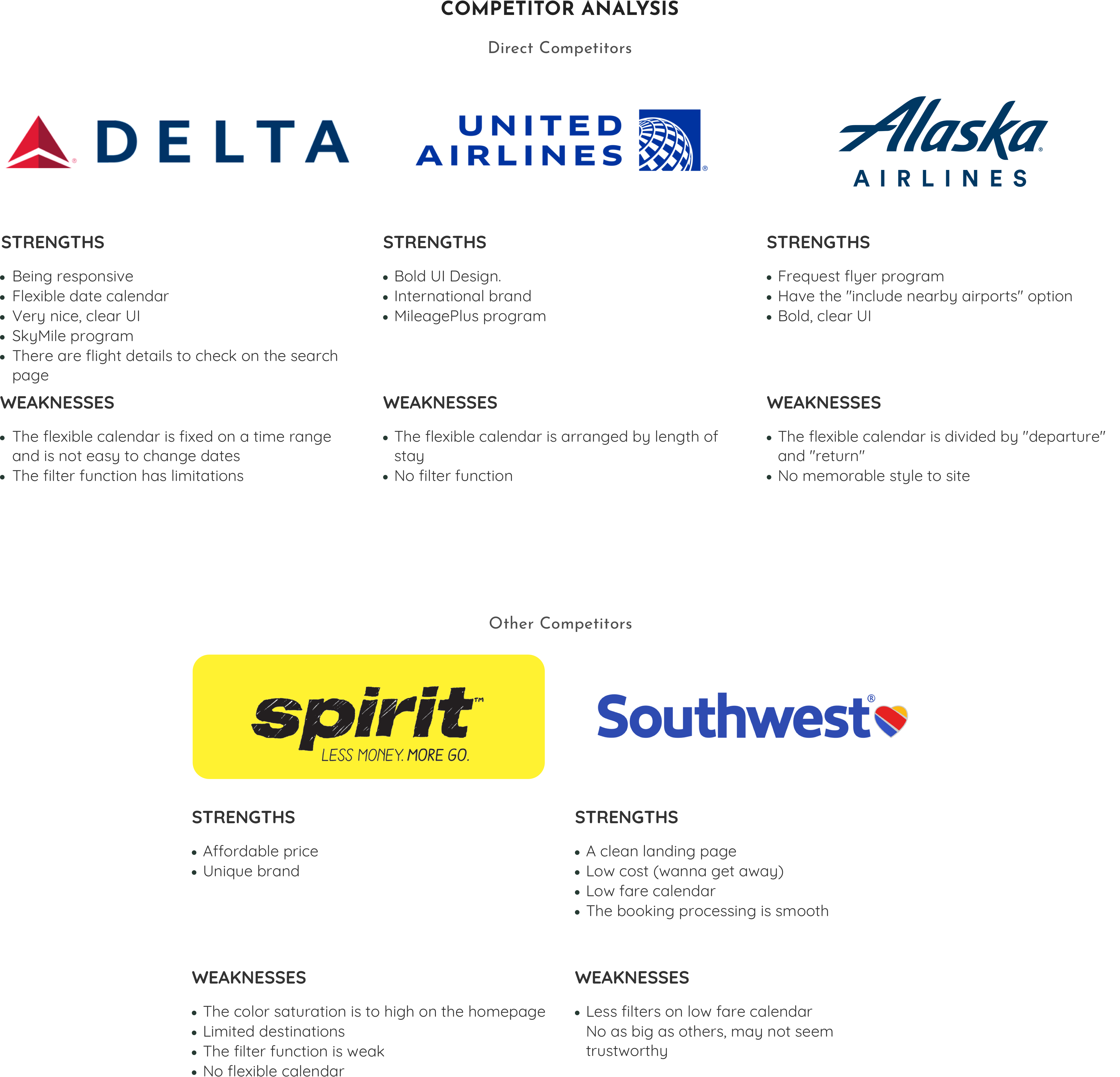
Research began by looking at competitors in the marketplace, which was conducted to learn more about other competitors' online flights booking website design that already exists. The goal of this secondary research is to explore their pain points and gain points.
After completing the secondary research, research questions were created and organized into 1:1 interview. Interviews were carried out with 6 people who frequently book their trip online to understand their expectations by asking them questions and observing their online booking behaviors.
As most airline sites are not friendly with mobile, I prefer to use a laptop.

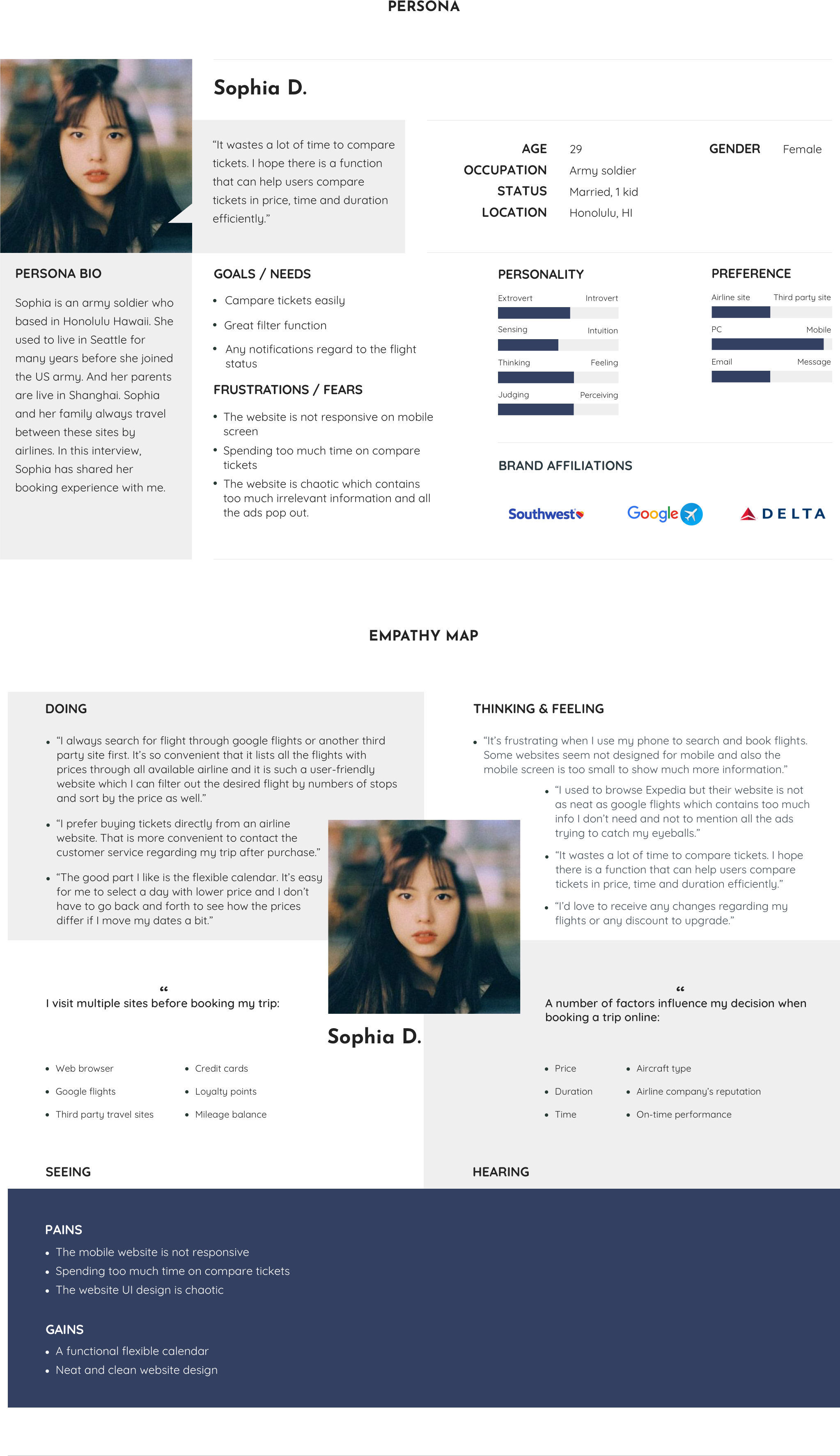
It wastes a lot of time to compare tickets. I hope there is a function that can help users compare tickets in price, time and duration efficiently.
Firstly, from the competitor analyzing I found most competitors' websites are incompetent in tickets comparison function. Also, some competitors' websites are not friendly with mobile devices, which force users to book by a desktop. As a user of flight tickets booking website, I want the flexible calendar to be more simple to use that I can compare price easily. I would consider this issue in my project design.
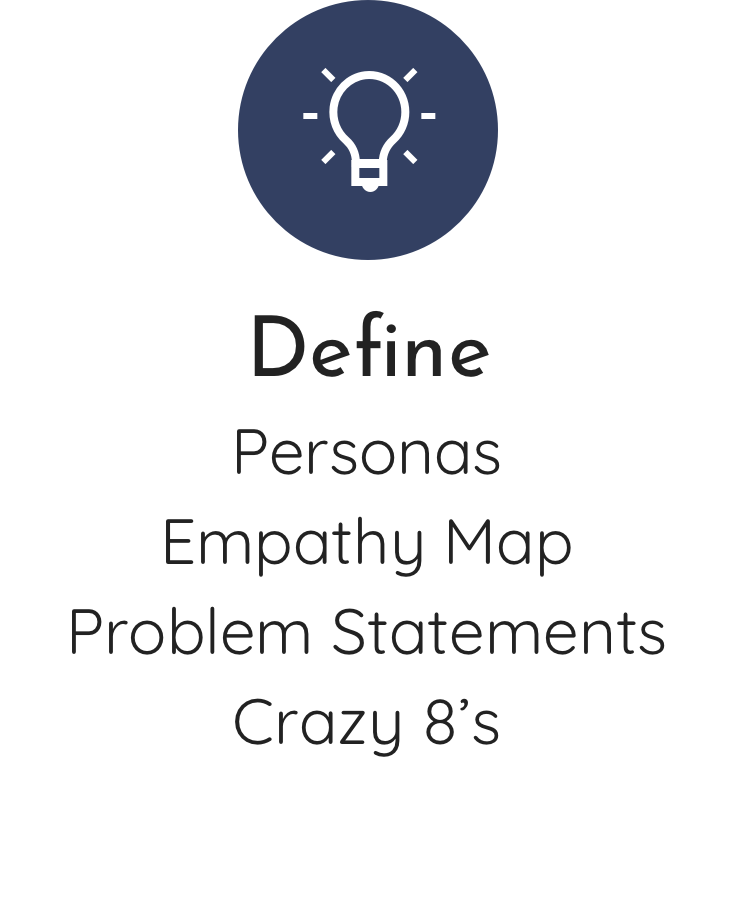
From the research data, I proceeded to create a persona and an empathy map to understand our users on a deeper level and a potential solution.
Sophia D. is an army soldier who based in Honolulu, Hawaii. She and her family always travel between Hawaii and the US mainland by airlines. In this interview, Sophia has shared her booking experience with me.
Base on the research results above, how might we:
● Develop a mobile friendly flights booking web.
● Build an efficient flexible calendar function and make it fit into the mobile screen.
● Design a neat and clean user interface.
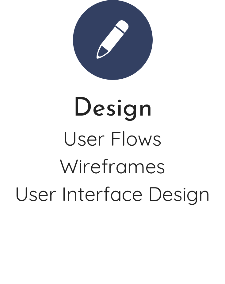
After reviewing the "How Might We" statements, I brainstormed and went about this by creating a number of sketches to generate as many ideas as possible. I thought about automation, interface, content, etc.

Base on the crazy 8's wireframes, a user flow was created and which visualizes the path a user would take to complete a task. In this case, the flow is mapping out the path from entering the site homepage through completing a trip booking.

Referring to the user flow, wireframes were built for each screen of the flow by using Sketch.

In order to retain brand recognition, the logo remains with the iconic globe icon. To modernize the logo, the globe has been simplified to four lines. And I tweaked the original light blue into dark blue as the primary color to represent elegant, playful and aspirational (but not "luxury"). The fonts were chosen to represent these value as well.


A High-Fidelity prototype was built to test the usability. In this testing, participants were given a scenario with a task to complete:
● Book a roundtrip ticket from San Jose to Los Angeles on the lowest price via "Flexible Calendar". The depart and return date should be May 31, 2019 and June 02, 2019.

Form the feedback received during the usability tests I improved the prototype screens that the participants were struggling with, and then created the final screen designs for Pan Am.


If I were to continue with this project I would do more user testing and also play out a couple different user flows including the experience of adding a hotel and car rental to a trip. Generally speaking though, I’ve learned a lot about the experience of searching and booking a flight via an airline website.