A mobile app design that helps people monitor and manage their tooth.

A mobile app design that helps people monitor and manage their tooth.
As an industrial design student during my graduate school period, I have written a thesis titled "Guidelines for Designing Handheld Tools for the Elderly" and developed an electric toothbrush design project. Inspired by this project, I want to extend an app to cooperate with the toothbrush, help people, especially the elderly, keep their teeth healthy.

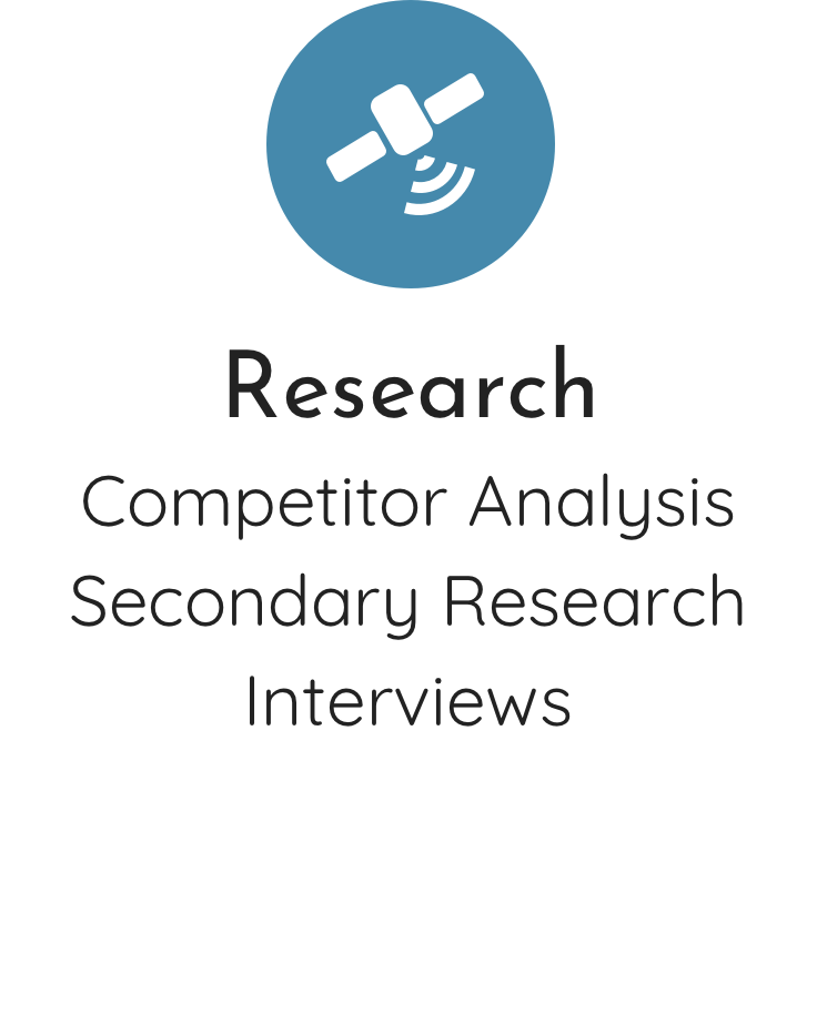


Research began with secondary research, which was conducted to learn more about other competitors' smart toothbrush app design that already exist. The goal of this secondary research is to explore their pain points and gain points.
Base on those finds from secondary research, survey questions were compiled and organized into 1:1 interview. I proceeded to do a 1:1 interview with 4 people aged over 45 years old to understand how they take care of their teeth regularly by asking them questions.
Furthermore, for the elderly user group, I have composed a thesis titled "Guidelines for Designing Handheld Tools for the Elderly". In this thesis, I did a lot of research on the physiology and psychology of aging.
When I push too much pressure on my teeth my gum will bleed.
I brush my teeth every morning and I don't do it every night only when I feel my mouth is not clean enough.
Firstly, from the existing smart toothbrush app design I found that some of them don't have charts to collect data and others' charts are difficult to read. As a healthy app for elderly people, making the data easy to collect and also the legibility of the charts are necessary. I would bring these research results to my own design.

In order to continue a 1:1 interview with people who age over 45 years old, I need to know them better. For this reason, I did research on common dental problems in elderly adults.

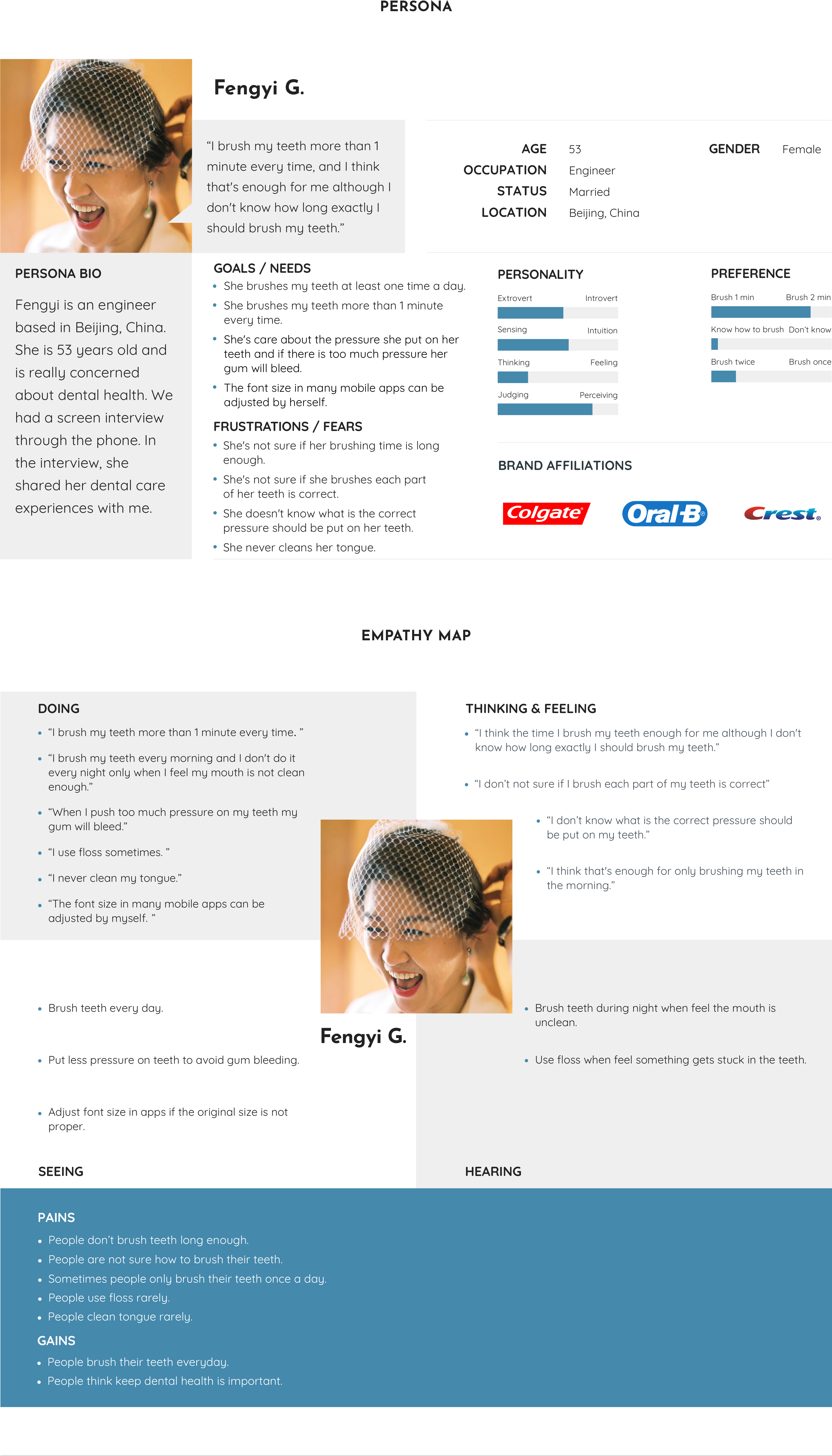
From the research and interview data, I proceeded to create a persona and an empathy map to understand our users on a deeper level and a potential solution.
Fengyi G. is an engineer who is 53 years old and really cares about her dental health. She shared her dental care experiences with me.
The main takeaways from my research and interviews were concluded under the empathy map which gives me inspirations on my own app design.
Base on the research results above, how might we:
● Develop a timer to remind users when to brush their teeth every day.
● Add a coaching system to guide users on how to brush teeth correctly.
● Encourage users to record their dental health daily.
● Make the data and charts legibly for users.
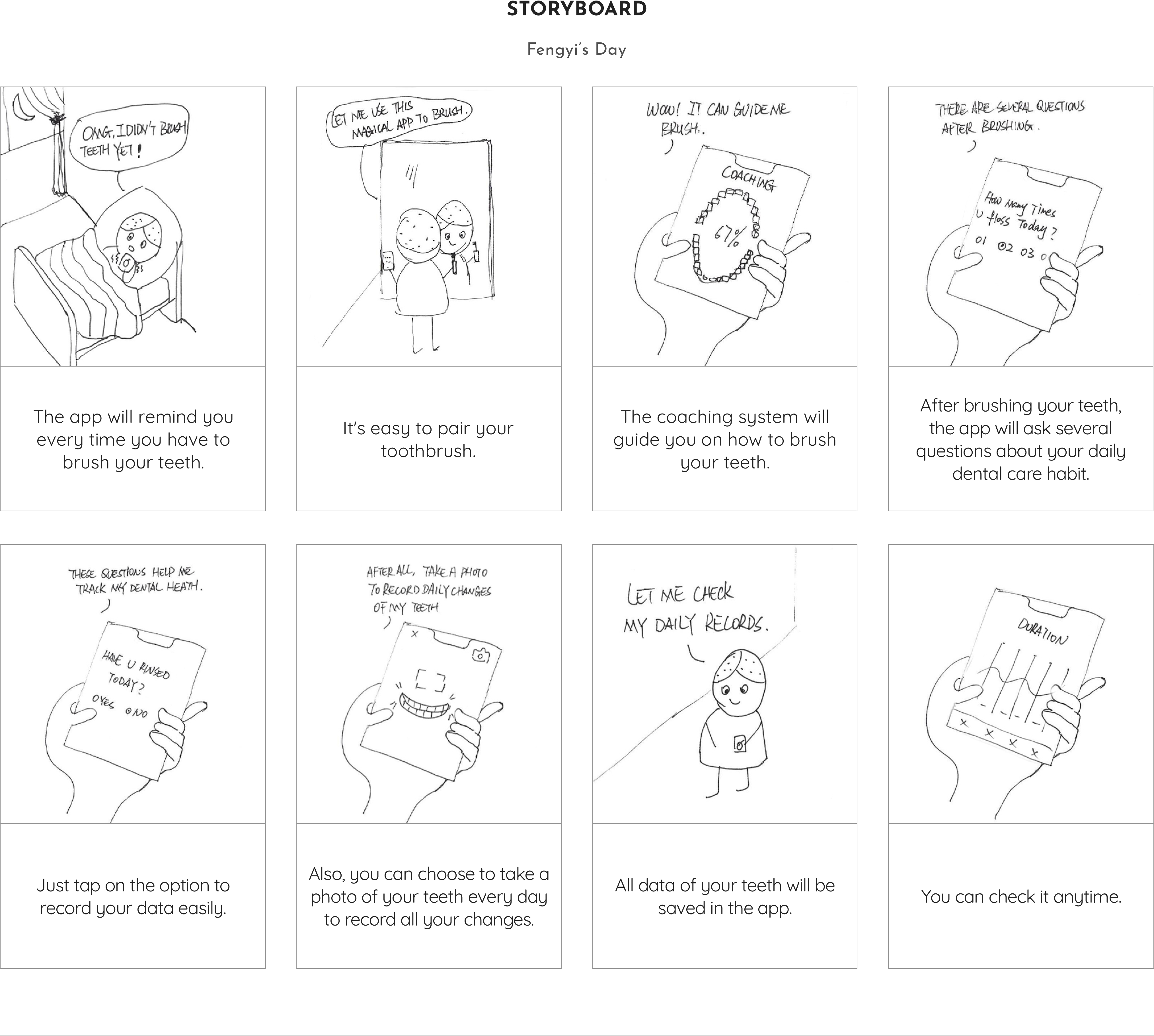
After reviewing the "How Might We" statements, I brainstormed and went about this by creating a number of sketches to generate as many ideas as possible. I thought about automation, interface, content, etc.

I chose one idea and put it into a storyboard to show the user journey and the screens they would see.
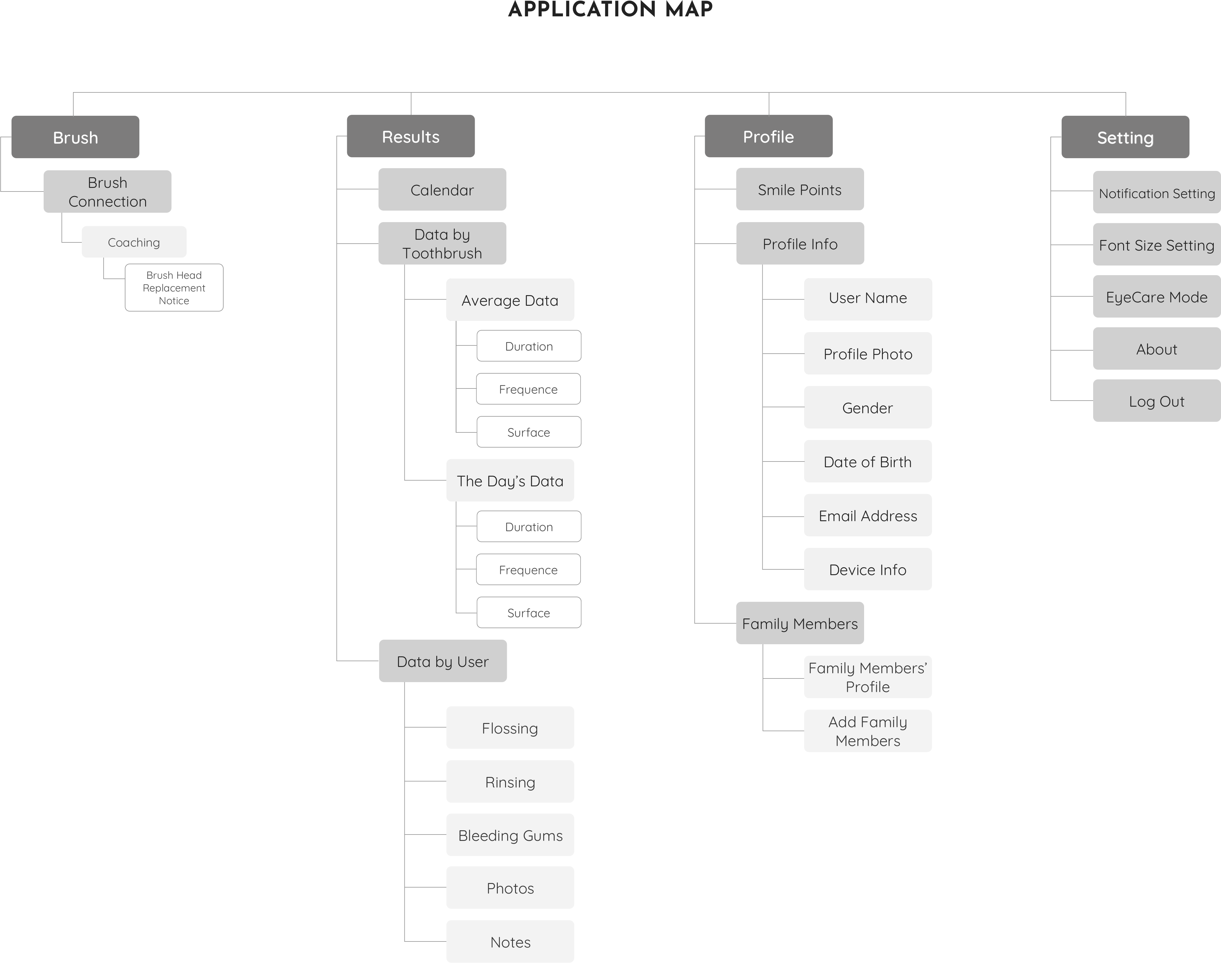
Based on this exercise, an application map was created in order to outline and organize the flows throughout the app.

The User Flow visualizes the path a user would take to complete a task. In this case, the flow is mapping out the path possibilities from entering the app through completing a brush process.

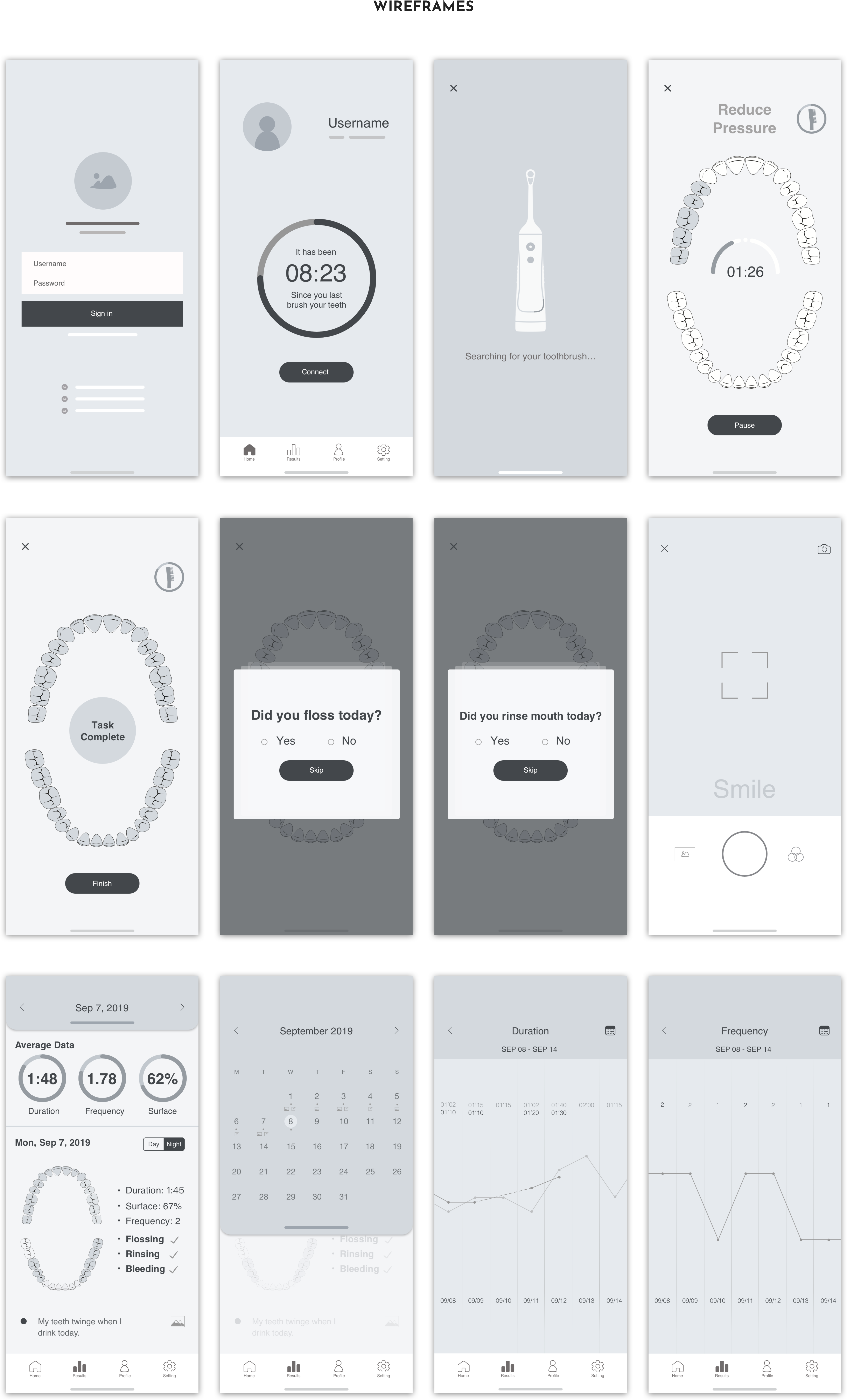
Before started drawing wireframes of the app, I researched how to brush correctly.

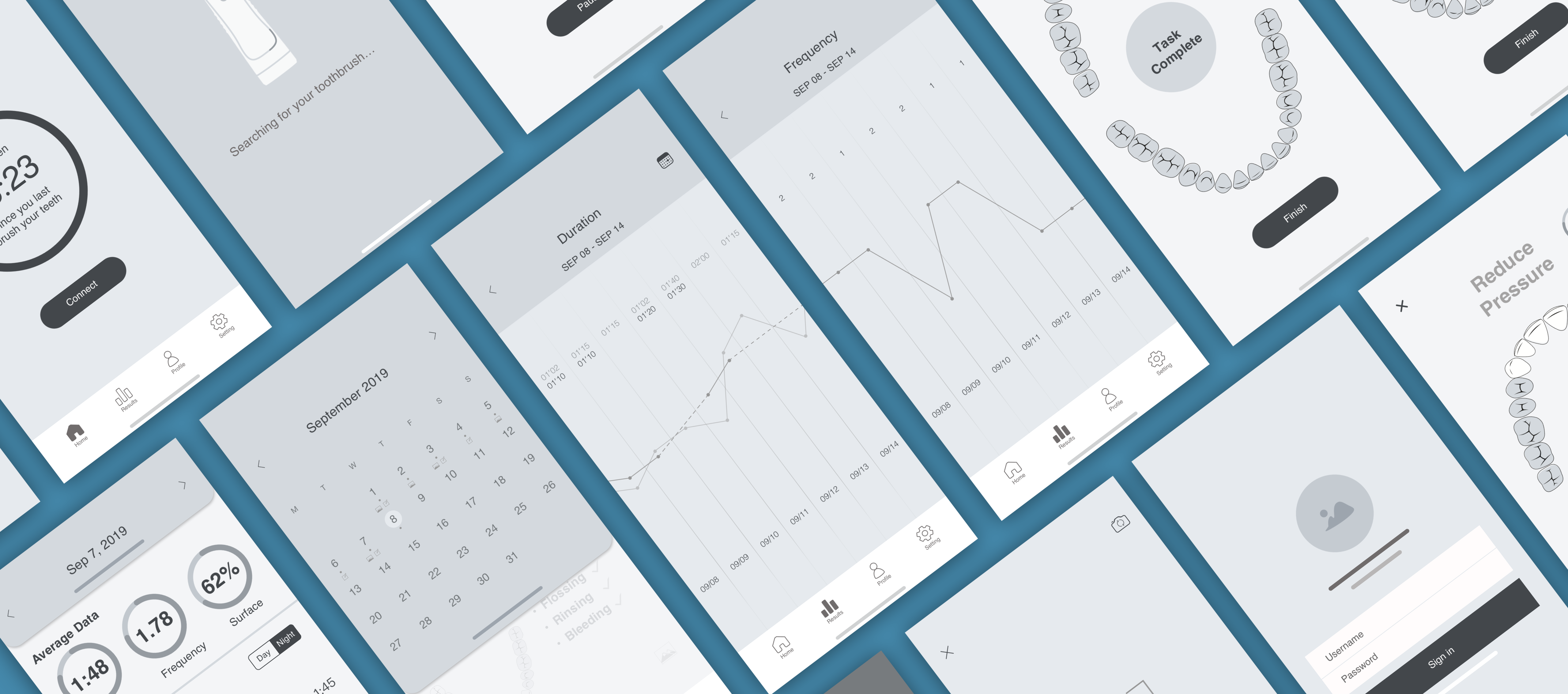
Referring to all exercises above, wireframes were built for each screen of the user flow by using Sketch.
In order to make my app friendly for both elderly and normal people, I did research on the visual issue before UI design.
Old people have difficulties distinguishing colors. In order to make elderly reading easily, the contrast between the foreground and background is one of the most important factors. There is a new concept proposed by Arthur and Passini, called contrast value. When the contrast value is 70% or higher, elderly people can read easily. The contrast value and relationship are shown below.

As discussed in my thesis chapter 2, many people over the age of 40 get presbyopia, presbyopia makes people unable to focus on small objects. There is a study in which differences in legibility and perceptions of font legibility were conducted by Bernard, Liao, and Mills in 2001. They found that for elderly users, over 14-point sans serif fonts are recommended.
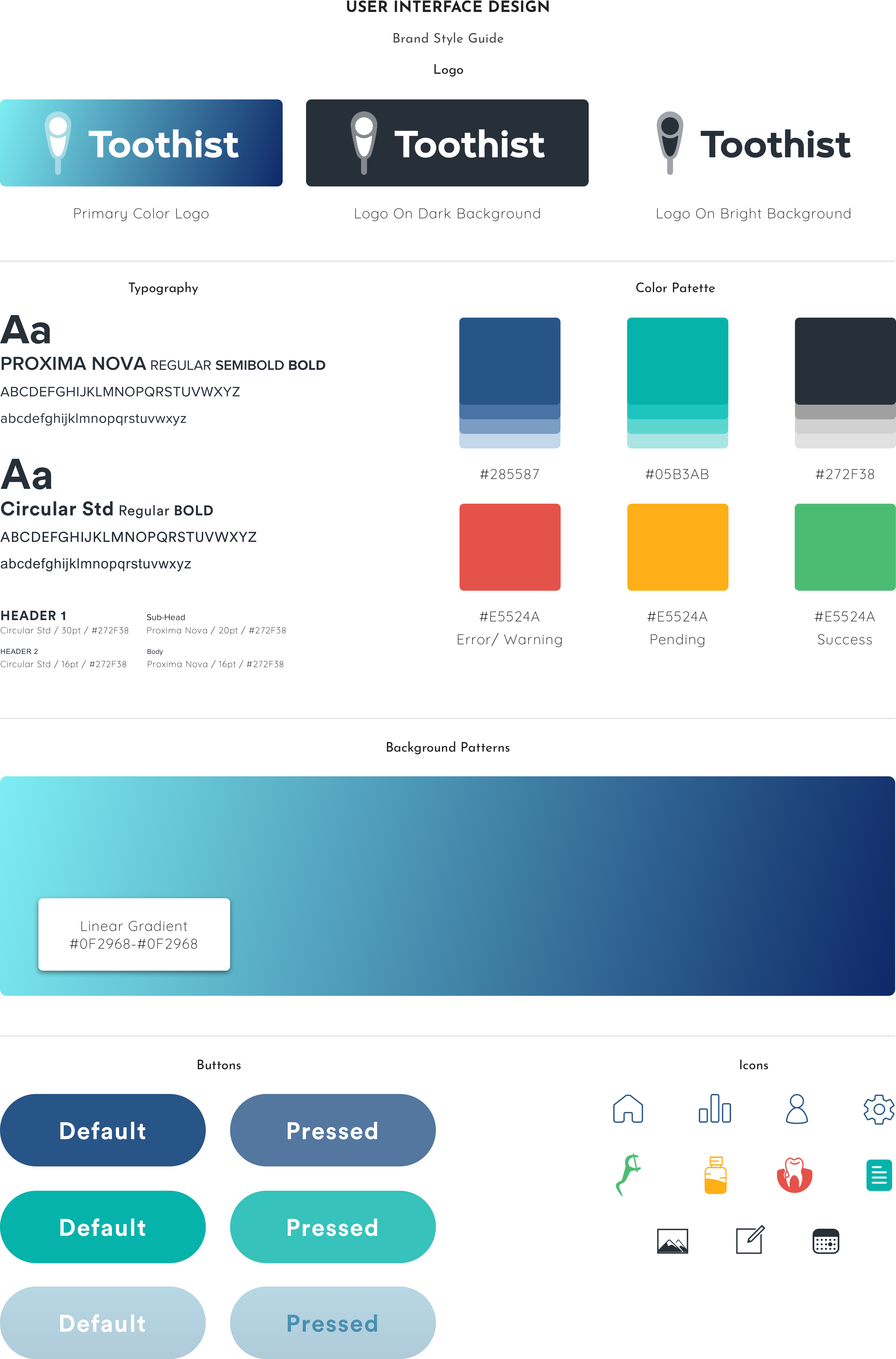
The brand that was created for Toothist is one that represents health, vitality, decency. Blue was chosen as the primary color to represent these values. The logo also embodies these qualities depicting the brush head outline of my electric toothbrush design.
A High-Fidelity prototype was built to test the usability. In this testing, participants were given a scenario with two tasks to complete:
● Complete a teeth brush routine.
● Check the data on Sep 7, 2019.

There were 4 participants, aged between 50-70 years old, did this usability testing. I observed them and took notes when they were doing this testing.
Base on the testing results, I created an affinity map to organize the notes I took.

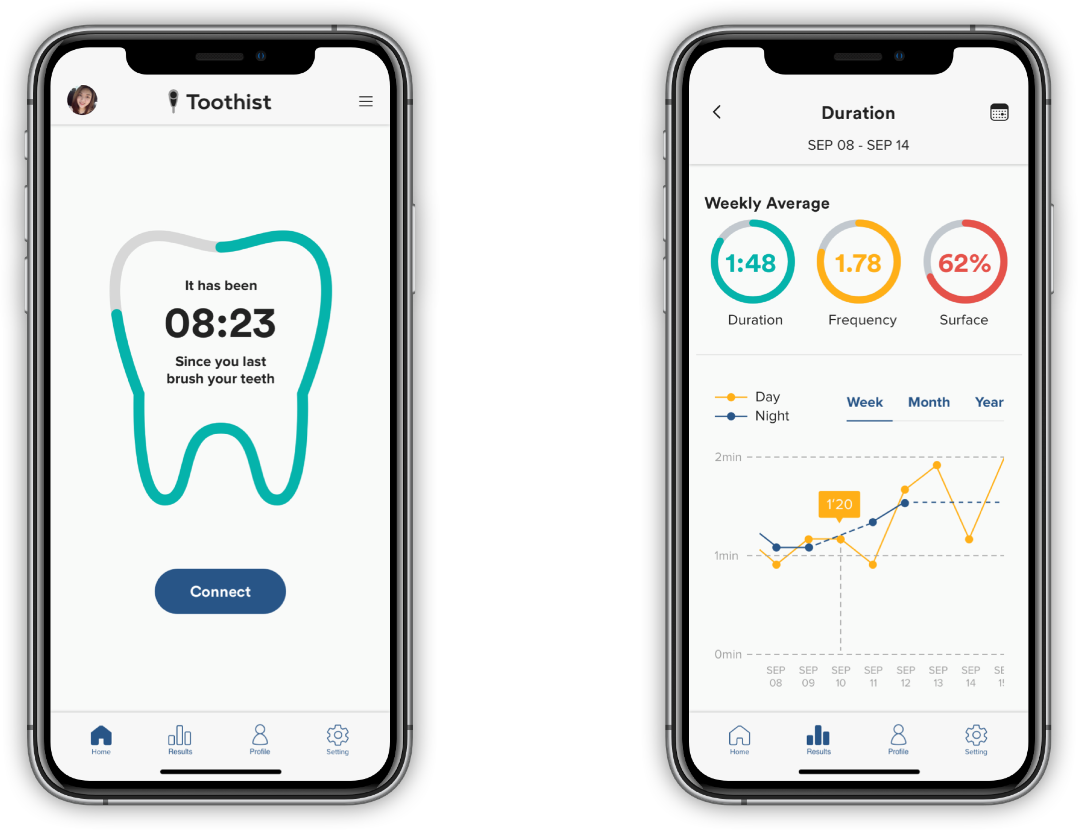
Base on the feedbacks received from the usability tests I improved the screens that the participants were having trouble with, and then using the style guide as reference create the final designs for the Toothist screens.


Designing Toothist gave me more confidence in working with the boundaries of the UX process. It is often tempting for me to follow a linear process or moving on only after I feel that I have all the elements right, but with Toothist, I jumped between phases many times when I decided it was necessary, whether it's going back and getting more research, fine-tuning the user flow after wireframing, or validating after every iteration. As a result, Toothist evolved into a much more stronger and relevant product.